Create a dashboard
Dashboards and panels enable you to visually represent your data. To display a visualization within a panel, you must have at least one associated query.
Before you start
-
Ensure that you have the correct permissions.
-
Understand the query language of the target data source.
Example
logql, promql or traceql
Create a dashboard
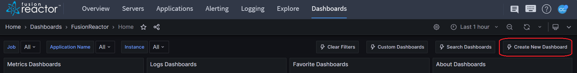
Step 1: Select Dashboards from the navigation menu.

Step 2: Click Create New Dashboard.
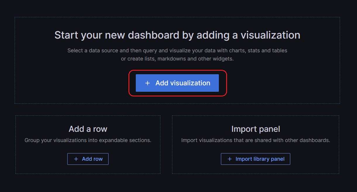
Step 3: On the empty dashboard, click + Add visualization.
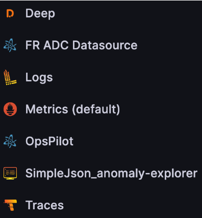
Step 4: In the dialog box that opens, do one of the following:
-
Select one of your existing data sources.
-
Select one of FusionReactor’s built-in special data sources.
-
Click Configure a new data source to set up a new one (Admins only).
Info
The Edit panel view initially displays your chosen data source, but you have the flexibility to modify the panel data source at a later time by utilizing the drop-down menu located in the Query tab of the panel editor, if necessary.
Step 5: Construct a query in the query language of your data source.
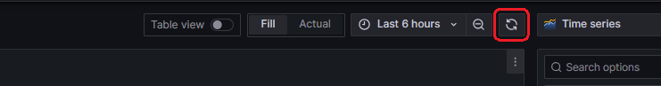
Step 6: Select the Refresh dashboard icon to query the data source.
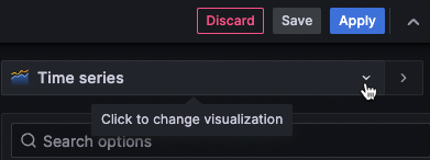
Step 7: In the visualization list, select a visualization type.
Learn more
Full list of available visualizations
Info
FusionReactor displays a preview of your query results with the visualization applied.
Step 8: Under Panel options, enter a title and description for your panel.
Step 9: Refer to the following documentation for ways you can adjust panel settings.
While not required, most visualizations need some adjustment before they properly display the information that you need.
Step 10: When you’ve finished editing your panel, click Save to save the dashboard.
Alternatively, click Apply if you want to see your changes applied to the dashboard first. Then click the save icon in the dashboard header.
Step 11: Enter a summary of your dashboard changes.
Step 12: Enter a title for your dashboard and select a folder.
Info
We recommend putting them in the general folder.
Step 13: Select Save.
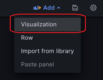
Step 14: To add more panels to the dashboard, click Add in the dashboard header and select Visualization in the drop-down.
Visualizations
Fusionreactor offers a variety of visualizations to support different use cases. This section of the documentation highlights the built-in visualizations, their options and typical usage.
Graphs & charts
| Type | Description |
|---|---|
| Timeseries | Default and main graph visualization. |
| State timeline | For state changes over time. |
| Status history | For periodic state over time. |
| Bar chart | Shows any categorical data. |
| Histogram | Calculates and shows value distribution in a bar chart. |
| Heatmap | Visualizes data in two dimensions, used typically for the magnitude of a phenomenon. |
| Pie chart | Typically used where proportionality is important. |
| Candlestick | Typically for financial data where the focus is price/data movement. |
Stats & numbers
| Type | Description |
|---|---|
| Stat | For big stats and optional sparkline. |
| Bar gauge | Is a horizontal or vertical bar gauge. |
Learn more
Read the documentation for more information on other visualizations available, including examples.
Setting up repeating rows
FusionReactor allows you to configure the addition of panels or rows to a dashboard dynamically, based on the value of a variable. These variables bring dynamic changes to your queries across all rows within the dashboard.
Before you begin
Ensure that the query includes a multi-value variable.
Configure repeating rows
Step 1: Click Dashboards in the left-side menu.
Step 2: Navigate to the dashboard you want to work on.
Step 3: At the top of the dashboard, click Add and select Row in the drop-down.
Info
If the dashboard is empty, you can click the + Add row button in the middle of the dashboard.
Step 4: Hover over the row title and click the cog icon.
Step 5: In the Row Options dialog box, add a title and select the variable for which you want to add repeating rows.
Step 6: Click Update.
Step 7: To provide context to dashboard users, add the variable to the row title.
Making a copy of existing dashboards
Making a copy of an existing dashboard and then editing it, rather than creating a new one from scratch can save valuable time.
Step 1: Navigate to the dashboard you wish to copy. For example, the Span Metrics dashboard.
Step 2: Click the Dashboard settings icon.
Step 3: Select Save as to display the Save dashboard copy screen.
Step 4: Change the name of dashboard in the Dashboard name box if required, and select General from Folder dropdown.
Step 5: Click Save
Editing a panel
After adding a panel to a dashboard, you can open it at any time to edit or update queries, add data transformation, and change visualization settings.
Step 1: Open the dashboard that contains the panel you want to edit.
Step 2: Hover over any part of the panel to display the actions menu on the top right corner.
Step 3: Click the menu and select Edit.
Tip
Keyboard shortcut: Hover over the panel and press e. The panel opens in edit mode.
Moving a panel
Step 1: To relocate a panel, simply choose your desired dashboard location.
Step 2: Access the left-side menu and click on Dashboards.
Step 3: Find the dashboard you wish to modify.
Step 4: Click on the panel title, then drag and drop the panel to its new position.
Resizing a panel
Step 1: Open the left-side menu and select Dashboards.
Step 2: Locate and select the dashboard you intend to edit.
Step 3: To adjust the panel's dimensions, click and drag the lower-right corner of the panel.
Configure thresholds
A threshold is a user-specified value associated with a metric, visually represented in a dashboard when the defined threshold is met or exceeded.
Thresholds offer a way to conditionally style and color visualizations based on query results. While not applicable to all visualizations, thresholds can be applied to various visualization types, including Time-series, Stat, Gauge, Geomap, Table, and State timeline.
Example
You can utilize thresholds to achieve the following effects:
-
Color grid lines or grid areas in the Time-series visualization.
-
Color the background or value text in the Stat visualization.
-
Color the gauge and threshold markers in the Gauge visualization.
-
Color cell text or background in the Table visualization.
There are two types of thresholds:
- Absolute thresholds, defined by a specific numeric value.
Example
80 on a scale of 1 to 150.
- Percentage thresholds, defined relative to the minimum or maximum value.
Example
80 percent.
Default thresholds are set by FusionReactor on visualizations that support them, with the following default values:
80 = red
Base = green
Mode = Absolute
The Base value represents minus infinity and typically corresponds to the good color.
Add or delete thresholds
You can add or delete thresholds as needed. FusionReactor automatically sorts threshold values from highest to lowest.
To add a threshold
Step 1 Edit the panel you want to add a threshold.
Step 2 In the options side pane, locate the Thresholds section, and click + Add threshold.
Step 3 Select a threshold color, number, and mode. The threshold mode applies to all thresholds on this panel.
Info
For a time-series panel, choose a Show thresholds option.
To delete a threshold
Step 1: Navigate to the panel containing the threshold.
Step 2: Click the trash icon next to the threshold you want to remove.
Info
Deleting a threshold removes it from all visualizations that include the threshold.
Need more help?
Contact support in the chat bubble and let us know how we can assist.